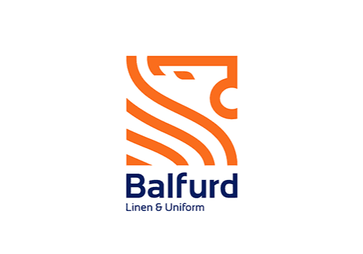
When a company’s nearing its centennial – Balfurd Linen & Uniform Service will mark its 100th anniversary in 2027 – it’s not unusual to want to brush up its image. Balfurd owner Monika Manter and her team recently did just that with the rollout of a new logo in multiple formats for the Tipton, PA-based mixed laundry operator. Below, she answered questions from Textile Services Weekly on the process.
Why did you think it was time to replace the old logo?
We wanted to replace the logo because we know how important logos are to a brand. People make decisions about a brand within seconds and a big percentage of consumers believe they “know” your brand simply by looking at the logo. For us, it was important to control that narrative about our business and not keep an old logo because it was the easy path. I’m the fourth generation in the business and we’ve been using that logo for as long as I can remember. We found an old advertisement that Balfurd put in the newspaper in the 1940s, and the logo was essentially the same as it is now. In short, the old logo didn’t represent who we are. We’ve changed a lot in the last 10 years (new generation at the helm, our culture, our mission, COVID-19, etc.) and the old logo no longer represented who we are as a company. The font was odd. The “B” in Balfurd was pointy and awkward and difficult to read. Doing business with us isn’t difficult or awkward. So we wanted to make sure the new font and logo represented that. It had to represent the ease of doing business with us.
Who came up with the idea to change the logo?
Dave Manter (Balfurd president and CEO) and I had been kicking around the idea of a new logo for a few years. Our 100th anniversary is quickly approaching and our goal is to have everything switched over to a new logo by then. Making the change now gives us the time and budget to do that without rushing and without a financial strain.
What outside consulting (marketing, graphic design) did you use in this project?
We talked to the different marketing companies and ultimately ended up using Infinite Laundry for the rebrand. They were able to give us three different versions of our logo to use as we saw fit. With our old logo, we only had a horizontal logo. Now we have horizontal and vertical logos, and a brand mark, which has proven useful.
Did you review a number of possibilities for the new one? Why did the one you picked stand out?
We had a few different choices when it came to the new logo. We’re in the unique position of having a family of companies (linen, uniform and healthcare rental, dry cleaning and restoration) so we needed to make sure the new logo made sense for each of those divisions. We also had a few non-negotiables when it came to the new logo. We knew we wanted to keep the orange and that the lion was an important and historic part of our brand. So this one made sense for us. It’s an updated version of who we are.
Click here to read Monika’s LinkedIn post announcing the new logo.
Publish Date
July 7, 2023
Categories
Sign Up For Our Newsletter
Receive the latest updates on the linen, uniform and facility services industry from TRSA delivered straight to your inbox.


